Day 13
Math 216: Statistical Thinking
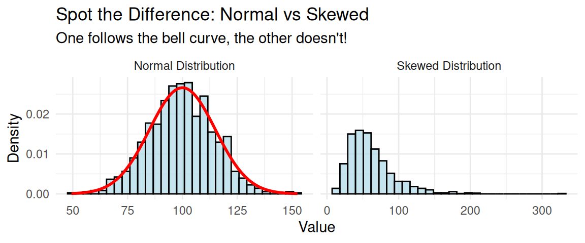
Visual Detective Work: Spot the Clues!
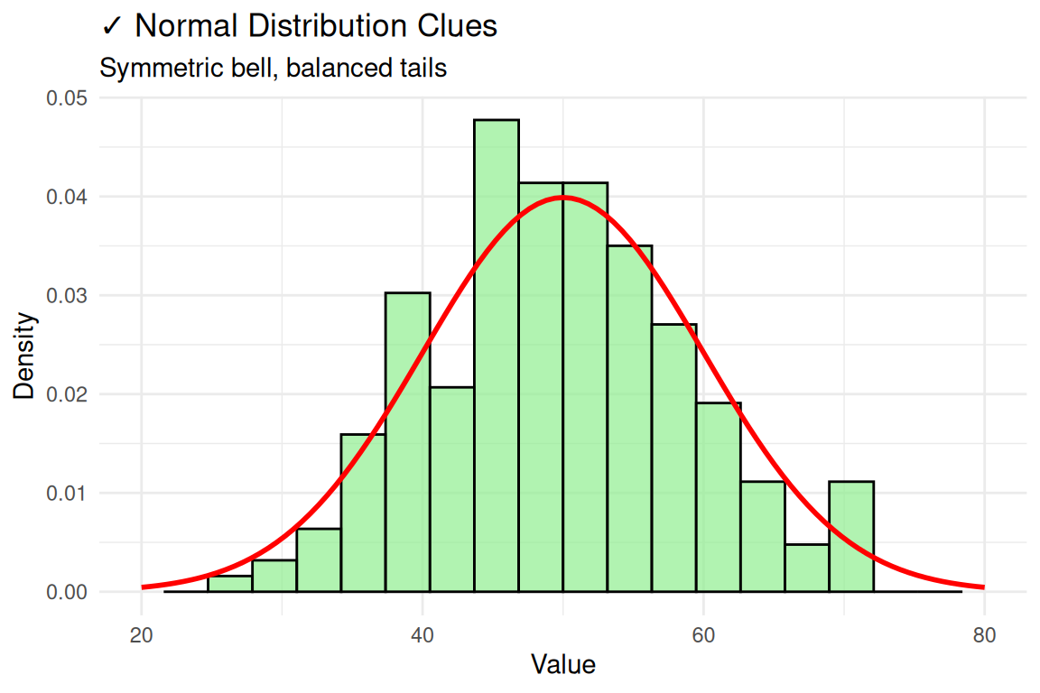
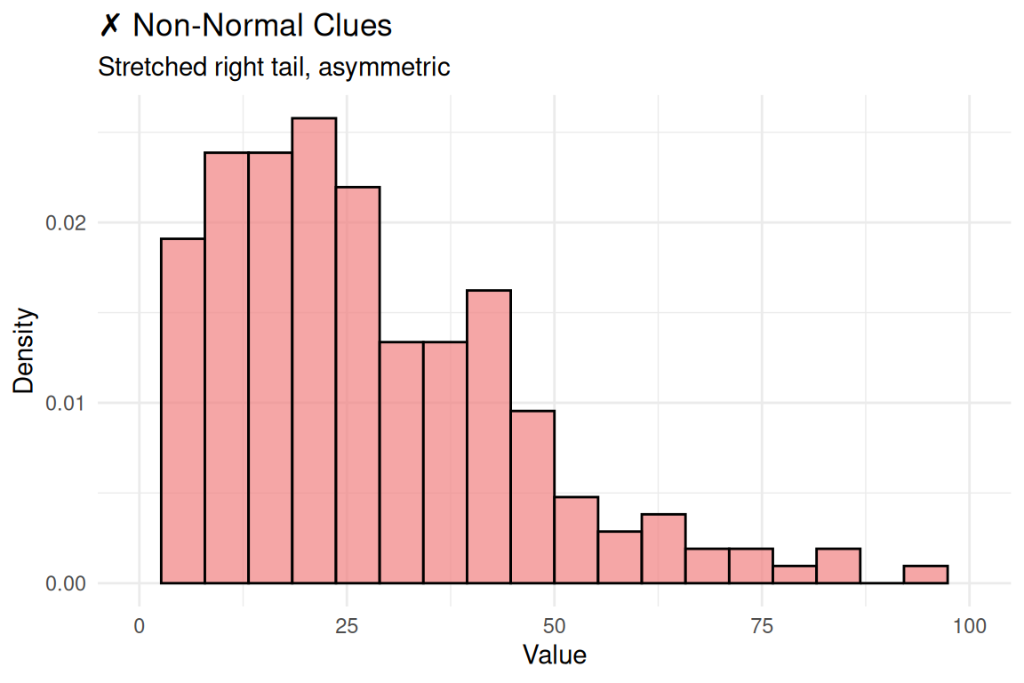
Visualization Approach
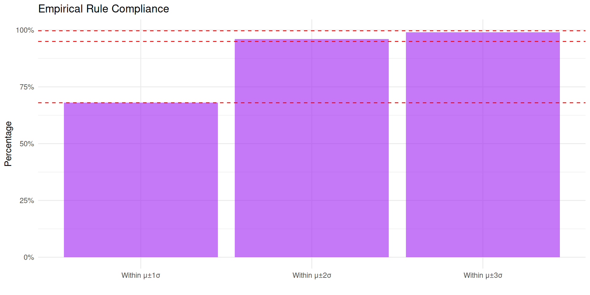
Normality Assessment
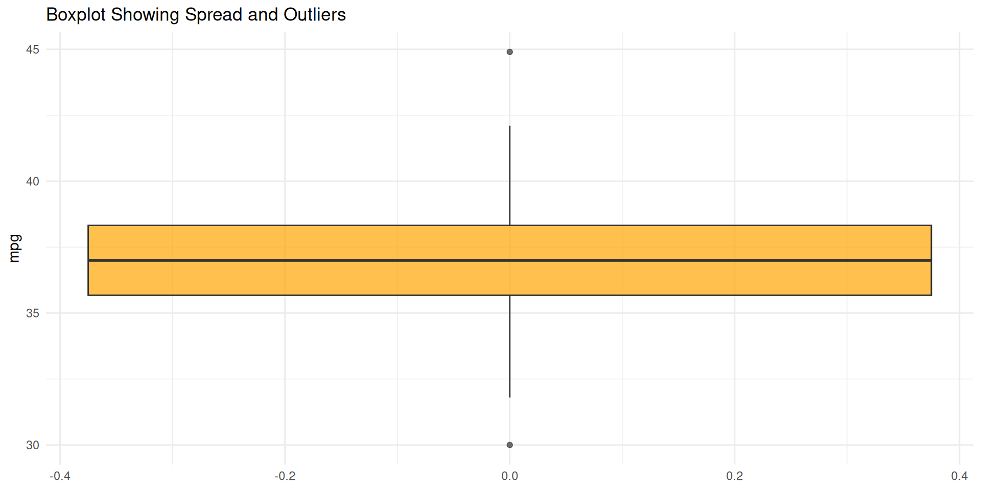
| IQR | SD | Ratio | Expected | Difference |
|---|---|---|---|---|
| 2.65 | 2.42 | 1.1 | 1.3 | -0.2 |
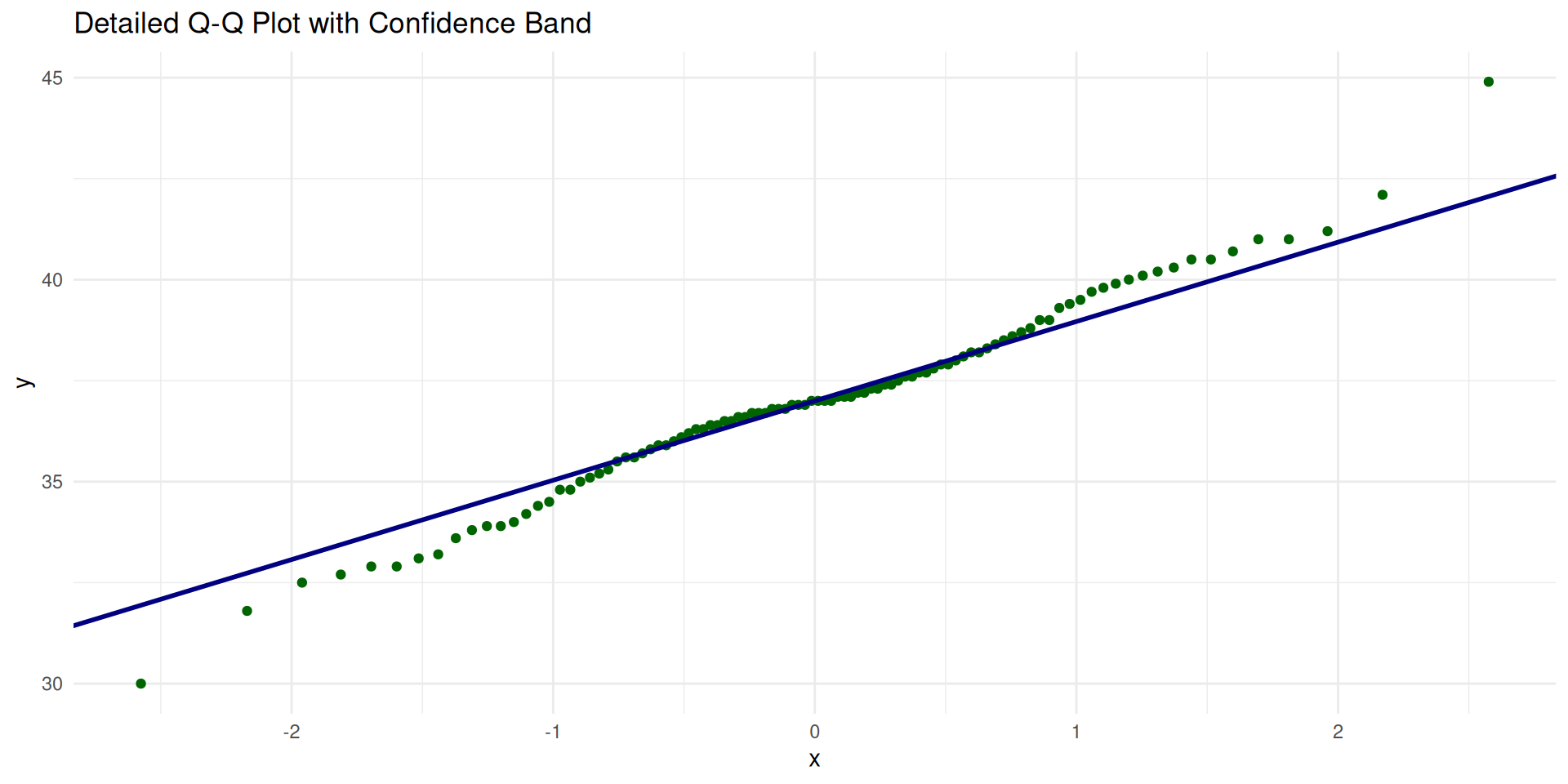
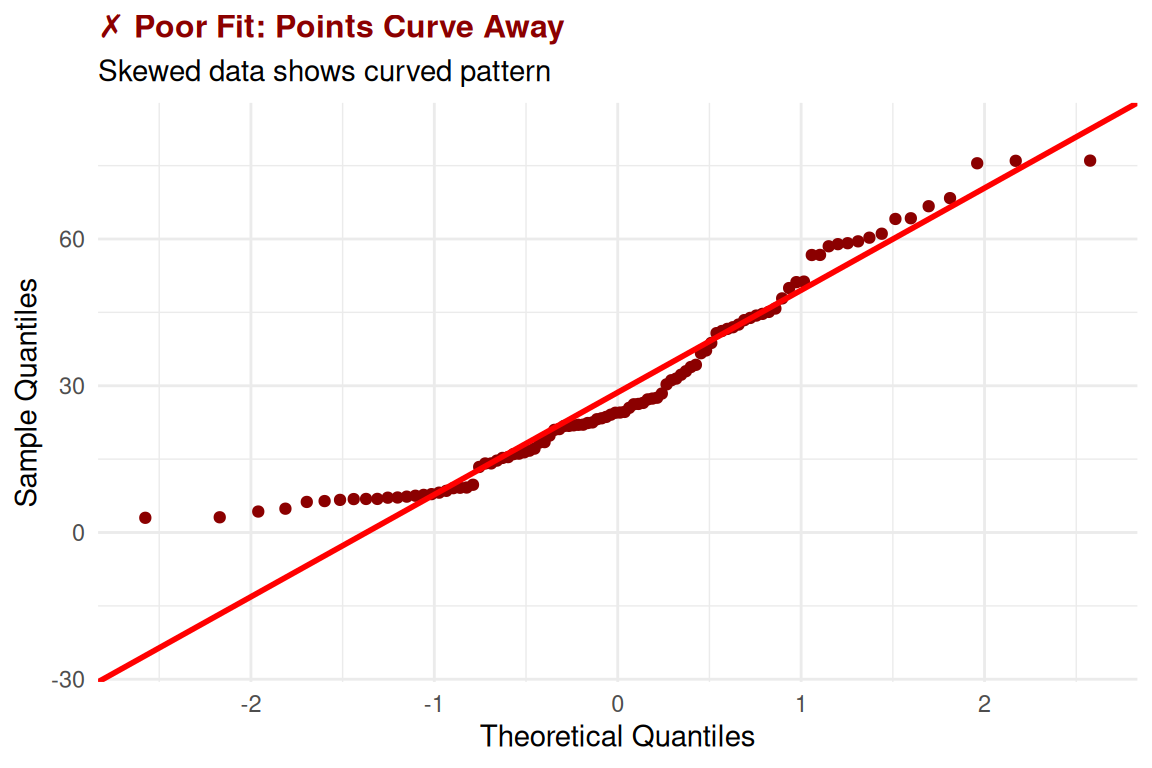
Reading Q-Q Plots: A Detailed Example
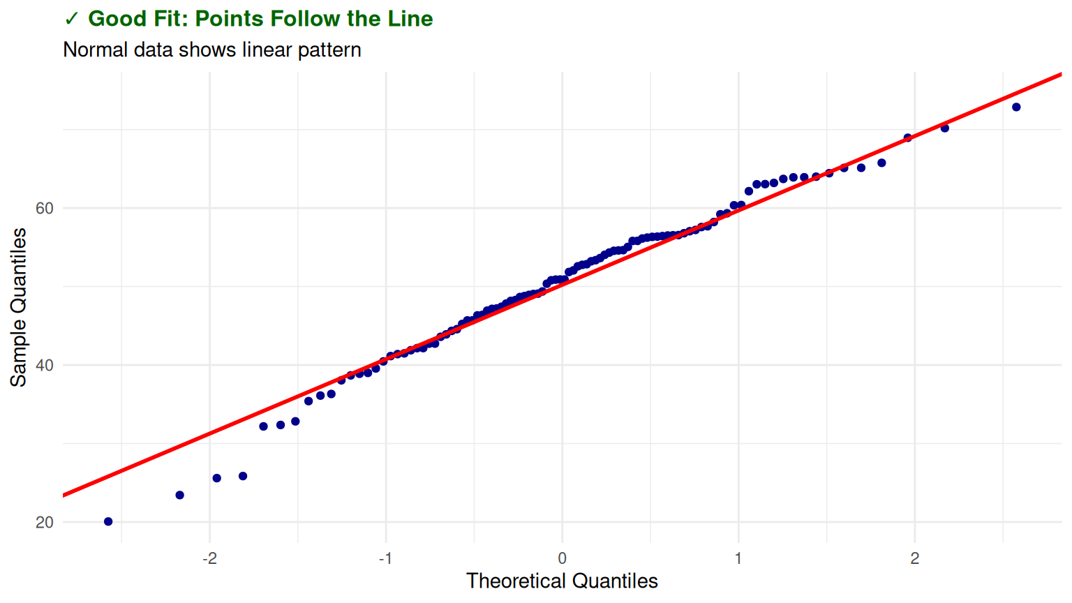
Test Your Detective Skills!
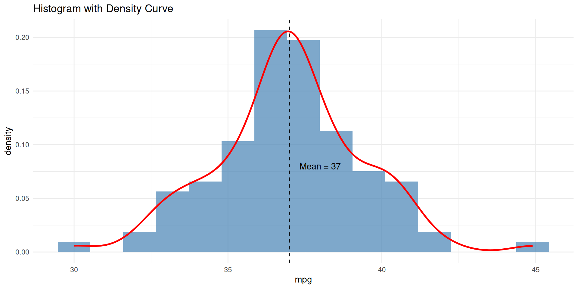
Your Turn! Look at this histogram and Q-Q plot:
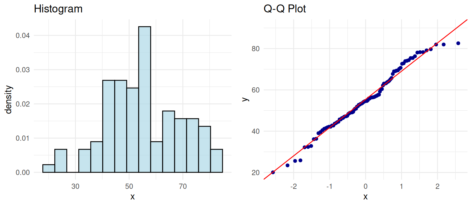
Question: Based on these plots, would you trust normal-based statistical tests for this data? Why or why not?
Transformation Success Story
![]()
![]()
The Magic: Log transformation turned our skewed data into approximately normal data!
Result: Now we can safely use normal-based statistical tests on the transformed data.
Pro Tip: Always transform back to original scale for final interpretations.