Day 35
Math 216: Statistical Thinking
Correlation & Simple Linear Regression
Key Question: How do two quantitative variables relate to each other? Let’s explore correlation and regression analysis!
Data Structure: Each case \(i\) has two measurements
- \(x_i\): explanatory variable (predictor)
- \(y_i\): response variable (outcome)
Real-World Examples:
- Temperature vs. cricket chirp rate
- Height vs. weight
- Study time vs. exam scores
Visualizing Relationships
Visualizing Relationships with Scatterplots:
A scatterplot shows the relationship between \((x_i, y_i)\) pairs, helping us understand:
- Form: Is the relationship linear or non-linear?
- Direction: Positive (upward slope), negative (downward slope), or no association?
- Strength: How closely do points cluster around the trend?
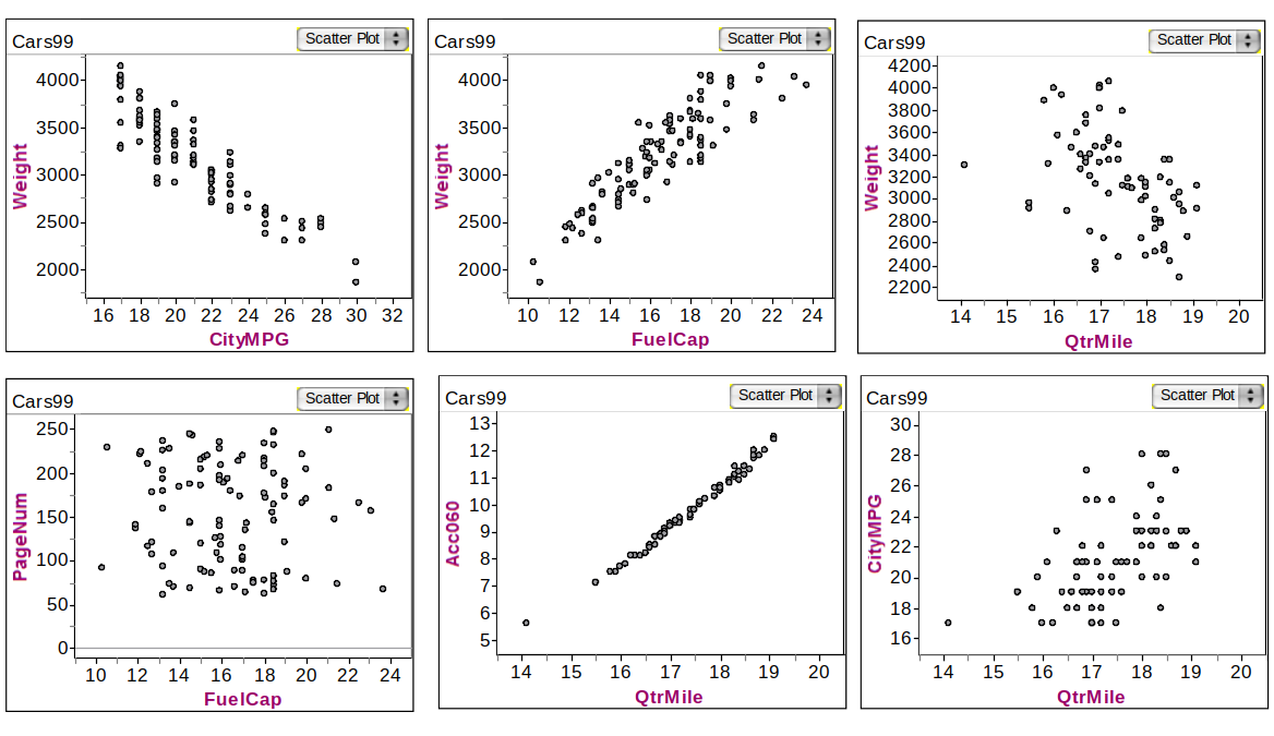
Example: Associations in Car dataset
Understanding Association Direction
Key Question: When one variable changes, what happens to the other?
Positive Association: As \(x\) increases, \(y\) increases
- Age of husband and age of wife
- Height and diameter of a tree
- Study time and exam scores
Negative Association: As \(x\) increases, \(y\) decreases
- Number of cigarettes smoked and lung capacity
- Depth of tire tread and miles driven
- Temperature and heating costs
Intuition: Positive relationships move together, negative relationships move apart!
Understanding Correlation: The \(r\) and \(\rho\) Story
Key Question: How do we measure the strength and direction of linear relationships? Meet correlation coefficients!
- Correlation Coefficients: \(r\) (sample) or \(\rho\) (population) quantify linear relationships
- Strength Scale: \(r \approx \pm 1\) (strong), \(r \approx 0\) (weak)
- Direction: Positive (\(r > 0\)) or negative (\(r < 0\)) linear association
The Correlation Formula: \[ r = \frac{\sum_{i=1}^n \left(\frac{x_i - \bar{x}}{s_x}\right) \left(\frac{y_i - \bar{y}}{s_y}\right)}{n-1} \]
Interpretation Guide:
- \(r = 1\): Perfect positive linear relationship
- \(r = -1\): Perfect negative linear relationship
- \(r = 0\): No linear relationship
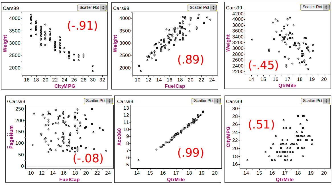
Car Correlations
Correlation & Regression Decision Framework
flowchart LR
    %% Styling definitions
    classDef start fill:#FFFACD,stroke:#FF8C00,stroke-width:2px,color:#000
    classDef decision fill:#E6F3FF,stroke:#1E88E5,stroke-width:2px,color:#000
    classDef action fill:#E8F5E9,stroke:#43A047,stroke-width:2px,color:#000
    classDef endStyle fill:#FFEBEE,stroke:#E53935,stroke-width:2px,color:#000

    %% Nodes
    %% Added <br/> to A and D to save horizontal space
    A(["Start: Two<br/>Quantitative Variables"]):::start
    B{"Create<br/>Scatterplot"}:::decision
    C{"Linear<br/>Pattern?"}:::decision
    D{"Calculate<br/>Correlation r"}:::decision
    E{"Strong?<br/>|r| > 0.7"}:::decision
    F["Fit Linear<br/>Regression<br/>ŷ = b₀ + b₁x"]:::action
    G["Consider<br/>Non-linear<br/>Models"]:::action
    H["Weak Rel.<br/>No Linear<br/>Model"]:::action
    I["Interpret<br/>Slope &<br/>Intercept"]:::endStyle

    %% Flow connections
    A --> B
    B --> C
    C -->|Yes| D
    C -->|No| G
    D --> E
    E -->|Yes| F
    E -->|No| H
    F --> I
    G --> I
    H --> I
Deterministic vs. Probabilistic Models
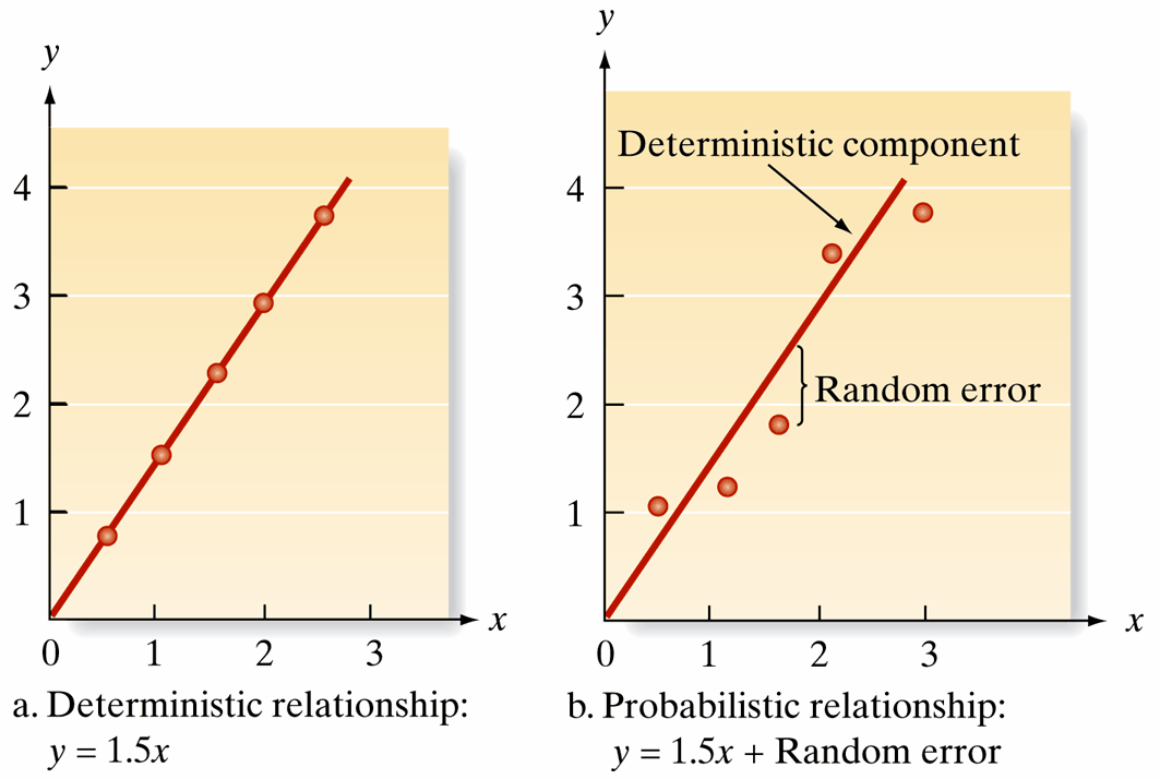
Deterministic vs. Probabilistic Models
Key Question: Are relationships in the real world perfectly predictable, or do we need to account for randomness?
- Deterministic Model: Perfect, predictable relationships without error
- Example: \(y = 1.5x\) (always exactly 1.5 times x)
- Reality Check: Rarely exists in real-world data!
- Probabilistic Model: Realistic relationships with randomness
- Example: \(y = 1.5x + \text{random error}\)
- General Form: \(y = \text{Deterministic component} + \text{Random error}\)
- Key Insight: Mean of random error is 0, so \(E(y)\) matches the deterministic component
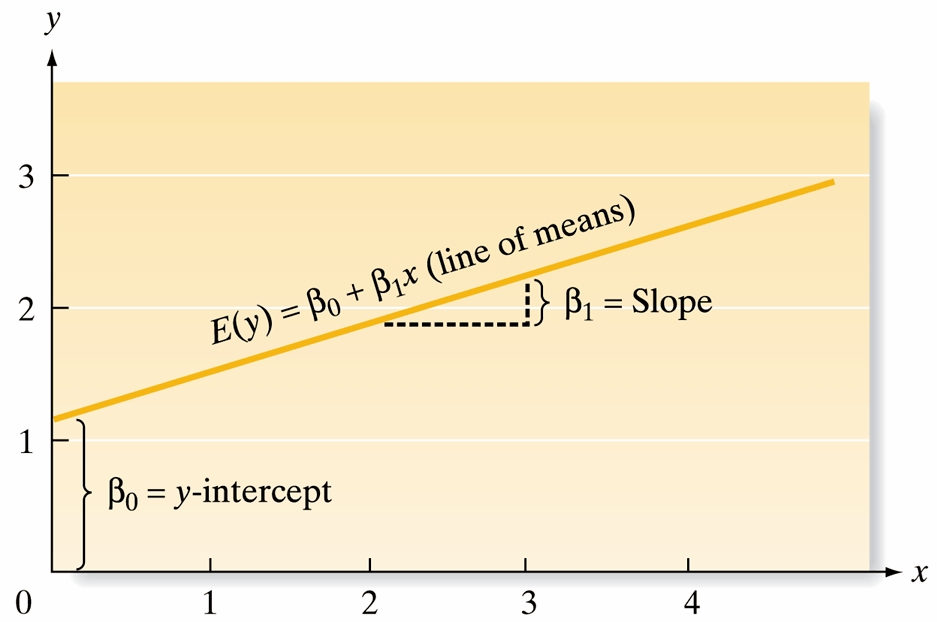
Linear Regression Model
Key Question: How do we find the best straight line to describe our data? Welcome to linear regression!
- Regression Equation: \(\hat{y} = b_0 + b_1x\)
- \(x\): explanatory variable (predictor)
- \(\hat{y}\): predicted response variable
- Parameters:
- Slope (\(b_1\)): How much \(\hat{y}\) changes for each unit increase in \(x\) \[ b_1 = \frac{\text{change }\hat{y}}{\text{change } x} \]
- Intercept (\(b_0\)): Predicted \(y\) when \(x = 0\) \[ \hat{y} = b_0 + b_1(0) = b_0 \]
Simple Linear Regression: Fitting and Evaluation
Key Question: How do we actually find the “best” regression line?
Three-Step Process:
- Hypothesize: Assume the deterministic component (e.g., \(E(y) = \beta_0 + \beta_1x\))
- Estimate: Use least squares to find the best-fitting line
- Evaluate: Assess model fit and use for prediction
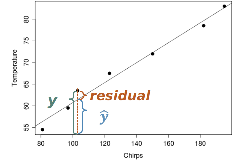
Residuals: The vertical distance from each point to the regression line
- Geometric Meaning: How far each point is from our “best guess” line
- Statistical Purpose: Help us measure how well our model fits the data
Residuals
Implementing Simple Linear Regression
Real-World Example: Can we predict cricket chirp rate from temperature?
- Research Question: Does temperature affect how fast crickets chirp?
- Model Approach: Use linear regression to predict chirp rate from temperature
- Practical Application: This could help estimate temperature by listening to crickets!
Methodology:
- Collect temperature and chirp rate data
- Fit a linear model using least squares
- Assess how well temperature predicts chirp rate
- Use the model for temperature prediction
Data Overview
| Observation | Temperature (°F) | Chirp Rate (chirps/15 sec) |
|---|---|---|
| 1 | 89 | 20 |
| 2 | 72 | 16 |
| 3 | 93 | 20 |
| 4 | 84 | 18 |
| 5 | 81 | 17 |
| 6 | 75 | 16 |
| 7 | 70 | 15 |
| 8 | 82 | 17 |
| 9 | 69 | 15 |
| 10 | 83 | 16 |
| 11 | 80 | 15 |
| 12 | 83 | 17 |
| 13 | 81 | 16 |
| 14 | 84 | 17 |
| 15 | 76 | 14 |
Step-by-Step: Cricket Chirp Analysis with lm()
Let’s analyze the cricket chirp data step by step using R’s lm() function!
# Create cricket chirp dataset
cricket_data <- data.frame(
  temperature = c(89, 72, 93, 84, 81, 75, 70, 82, 69, 83, 80, 83, 81, 84, 76),
  chirp_rate = c(20, 16, 20, 18, 17, 16, 15, 17, 15, 16, 15, 17, 16, 17, 14)
)

# Display first few rows
head(cricket_data)
temperature chirp_rate
1 89 20
2 72 16
3 93 20
4 84 18
5 81 17
6 75 16Step 1: Visualize the Relationship
Step 1: Create Scatterplot
First, let’s visualize the relationship between temperature and chirp rate with a scatterplot.
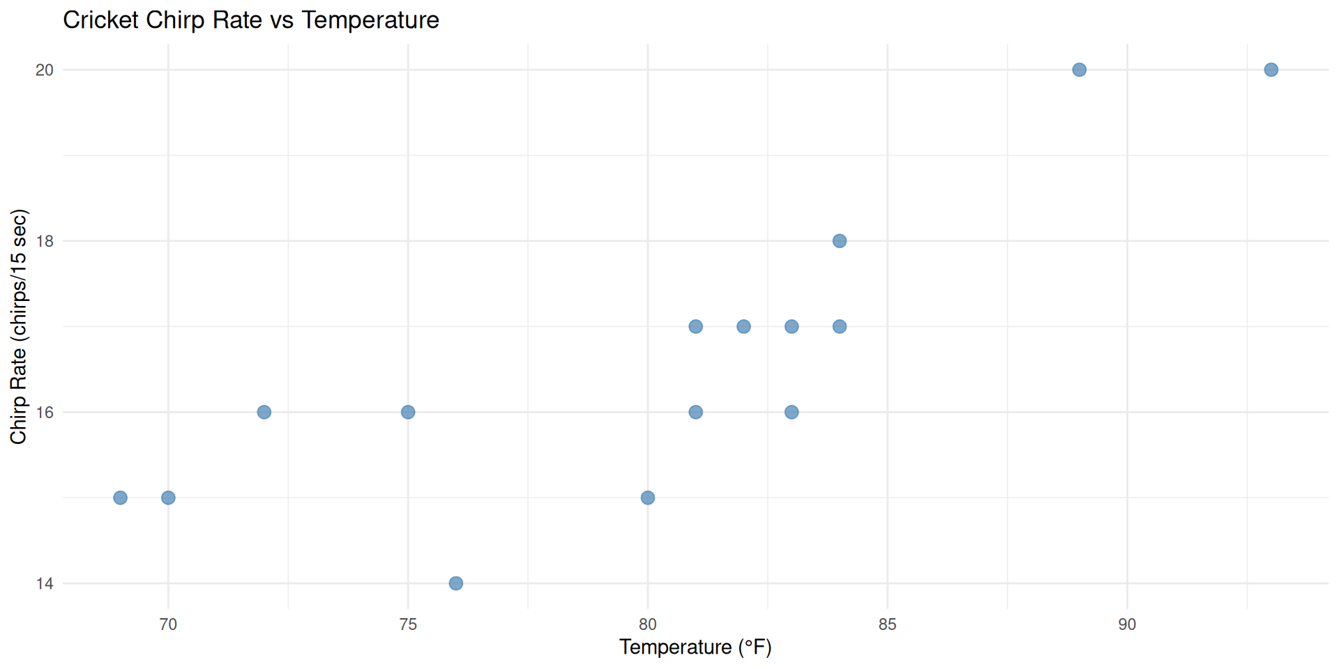
Observation
We can see a clear positive linear relationship - as temperature increases, chirp rate also increases!
Step 2: Fit Linear Regression Model
Step 2: Fit Linear Model
Now let’s fit a linear regression model using R’s lm() function.
# Fit linear regression model
chirp_model <- lm(chirp_rate ~ temperature, data = cricket_data)
summary(chirp_model) # Display model summary
Call:
lm(formula = chirp_rate ~ temperature, data = cricket_data)

Residuals:
    Min      1Q  Median      3Q     Max
-1.7246 -0.6013  0.2164  0.6280  1.5221

Coefficients:
            Estimate Std. Error t value Pr(>|t|)
(Intercept) -0.37210    3.23064  -0.115 0.910064
temperature  0.21180    0.04018   5.271 0.000151 ***
---
Signif. codes:  0 '***' 0.001 '**' 0.01 '*' 0.05 '.' 0.1 ' ' 1

Residual standard error: 1.01 on 13 degrees of freedom
Multiple R-squared:  0.6812,    Adjusted R-squared:  0.6567
F-statistic: 27.78 on 1 and 13 DF,  p-value: 0.0001513
Step 3: Add Regression Line to Scatterplot
Step 3: Overlay Regression Line
Let’s add the regression line to our scatterplot to visualize the model fit.
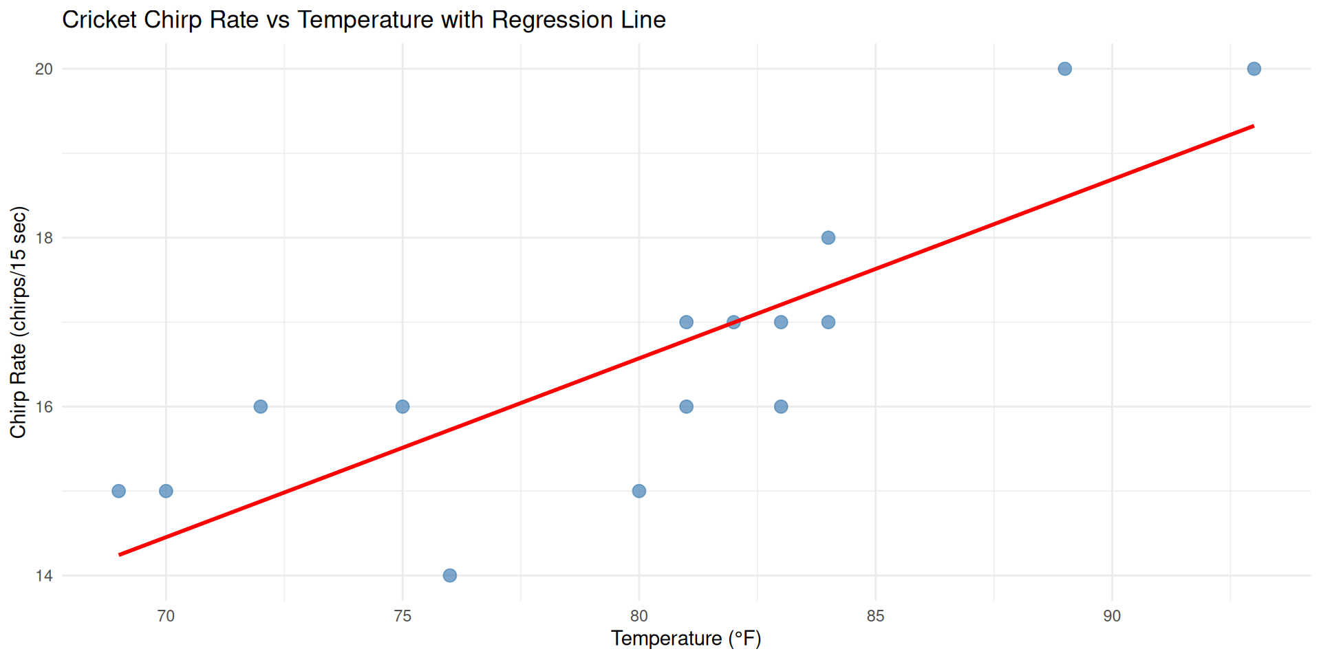
Visual Assessment
The red line shows our best-fit linear model. Points are generally close to the line, indicating a good fit!
Step 4: Visualize Residuals
Step 4: Examine Residuals
Now let’s visualize the residuals - the vertical distances from each point to the regression line.
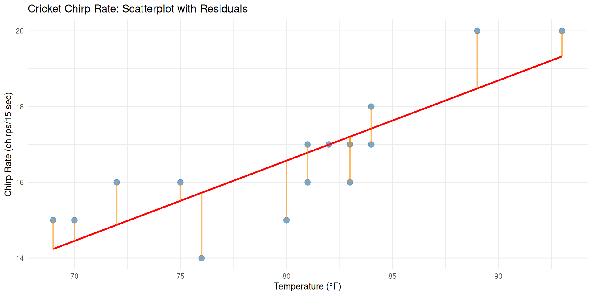
Understanding Residuals
The orange lines show residuals - how far each observation is from our prediction. Smaller residuals mean better model fit!
Summary: Cricket Chirp Analysis
Key Takeaways from our lm() analysis:
- Strong Positive Relationship: Temperature strongly predicts cricket chirp rate
- Model Equation: \(\hat{y} = -0.372 + 0.212x\)
- Good Fit: R² = 0.681 (68.1% of variation explained)
- Practical Application: Can predict chirp rate from temperature
lm() Function Benefits:
- Simple syntax:
lm(y ~ x, data) - Comprehensive output with coefficients, R², and significance
- Easy to extract predictions and residuals
- Foundation for more complex statistical modeling